Branding & Graphic Design
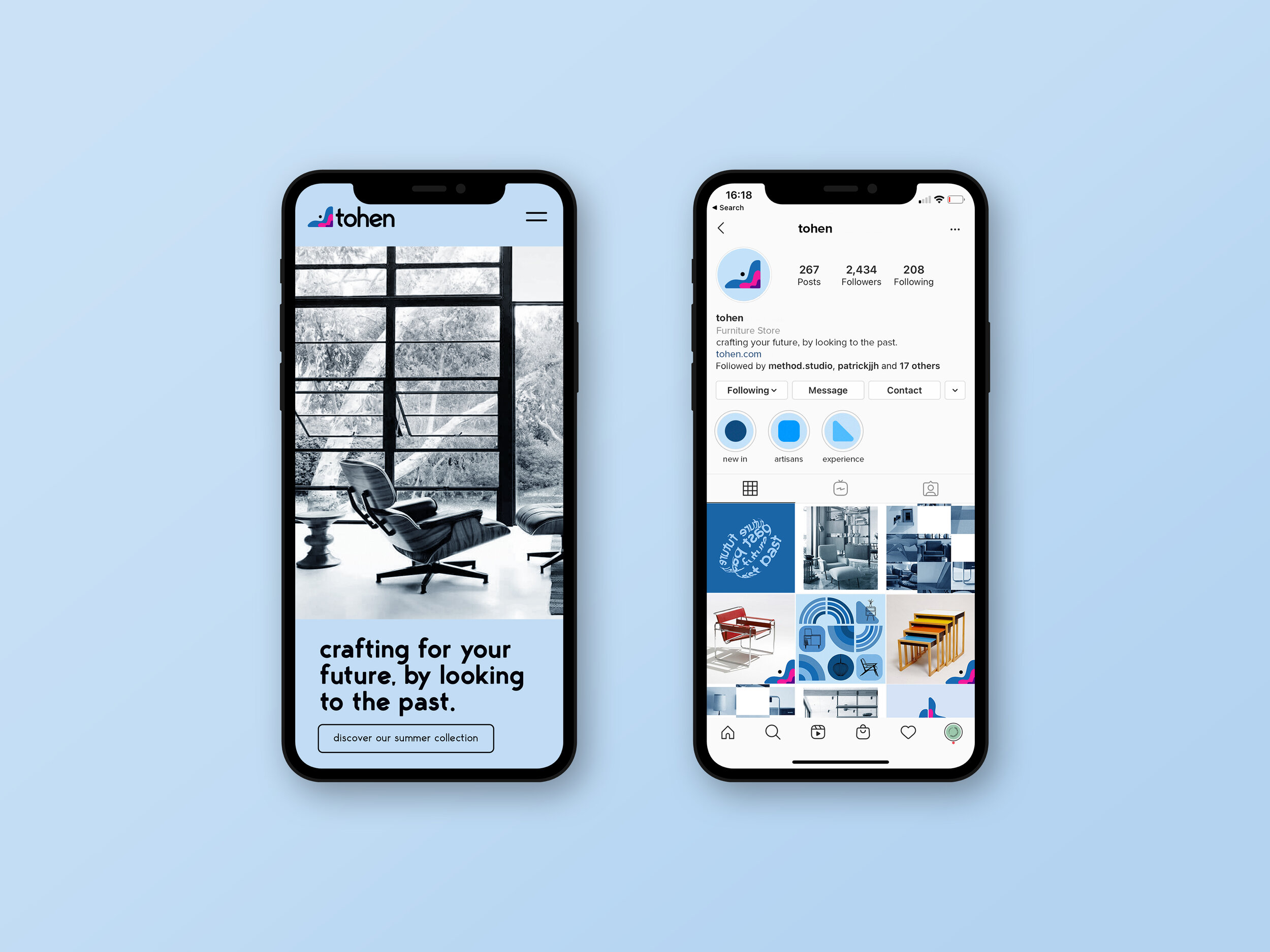
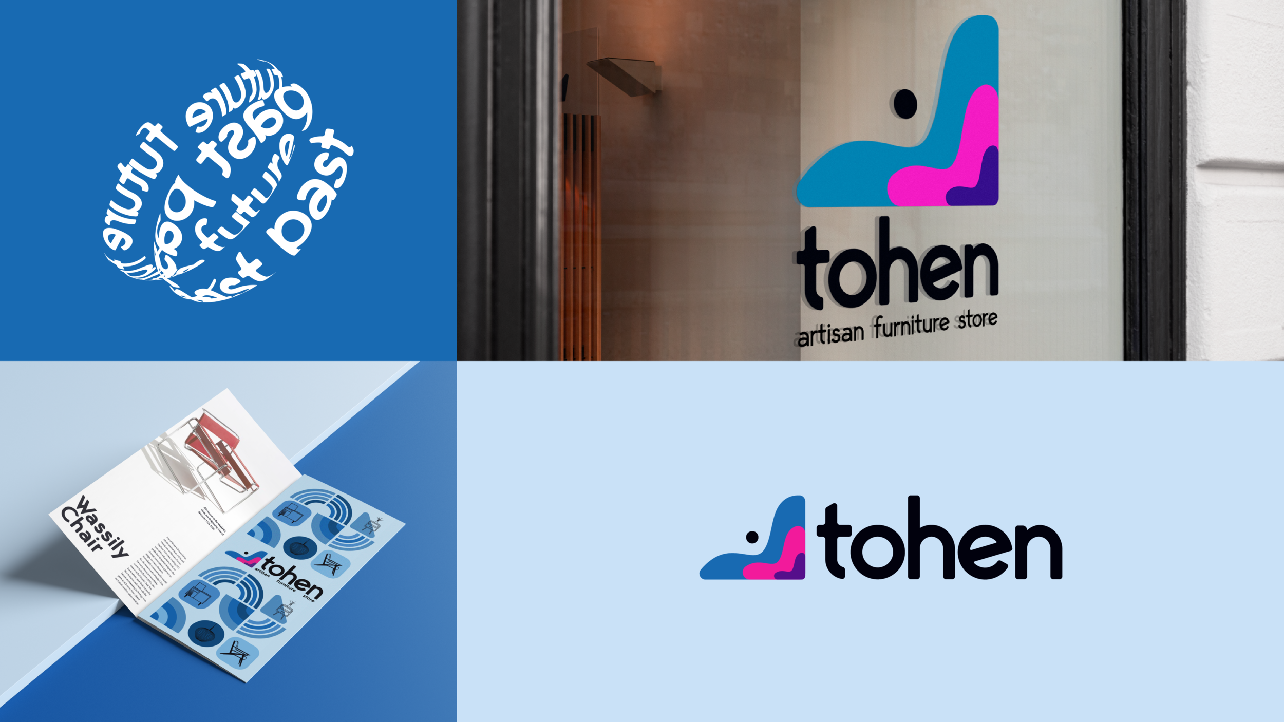
Crafted an entire visual identity for a high-end furniture & lifestyle store, tohen, who celebrate the culture of the 1960s.
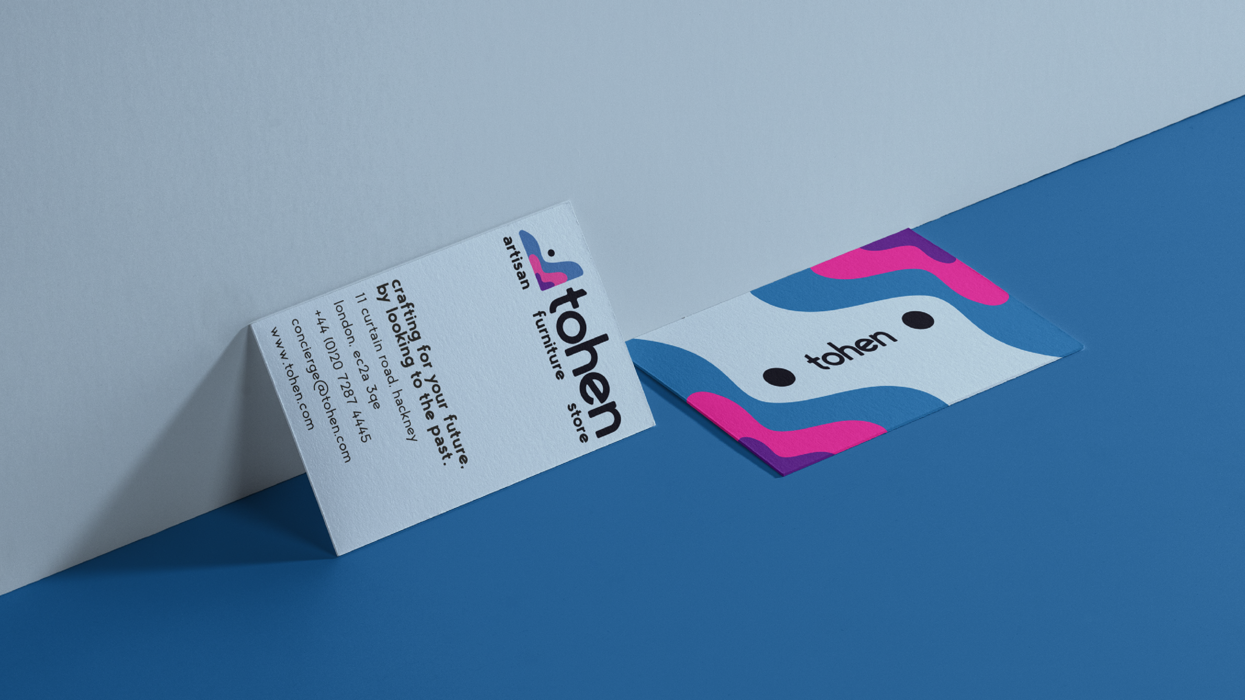
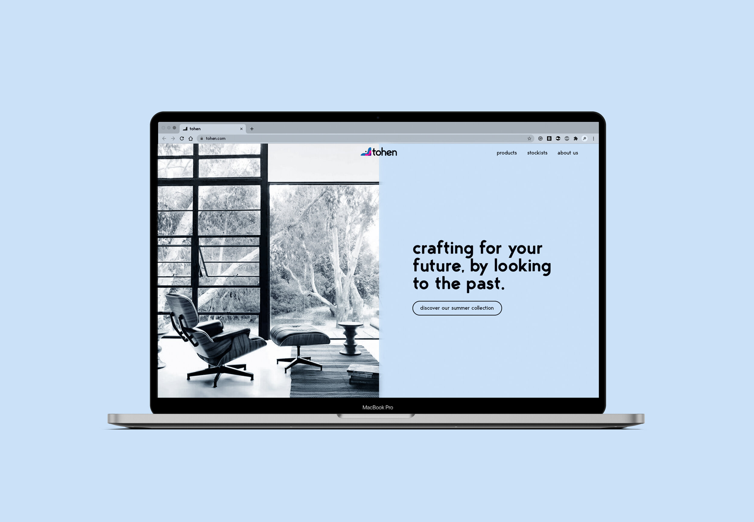
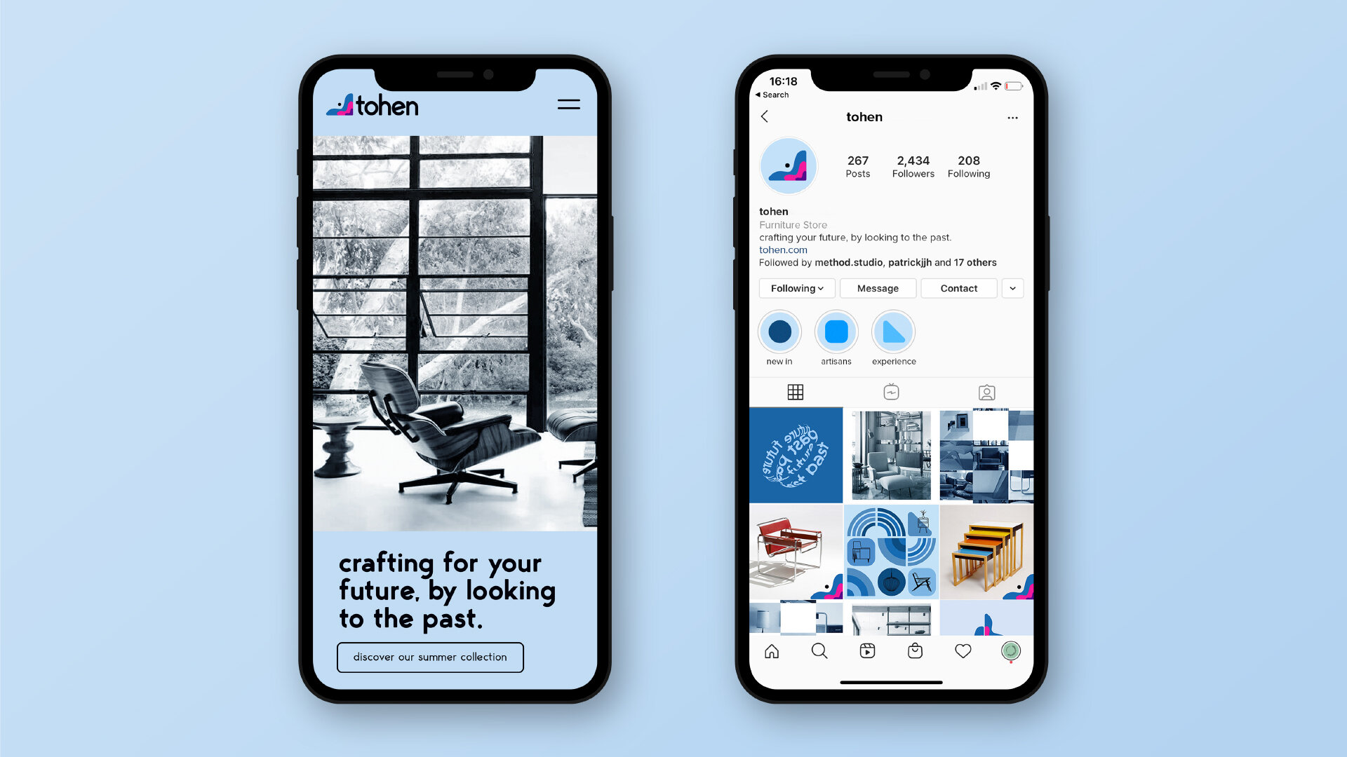
I provided the creative direction for all visual aspects of the brand, including identity, print, digital, POS, signage and social. The concept of the brand is to recapture the spirit of the 1960s, and the era’s iconic furniture. I ensured that this sensation translated to the customers visually.
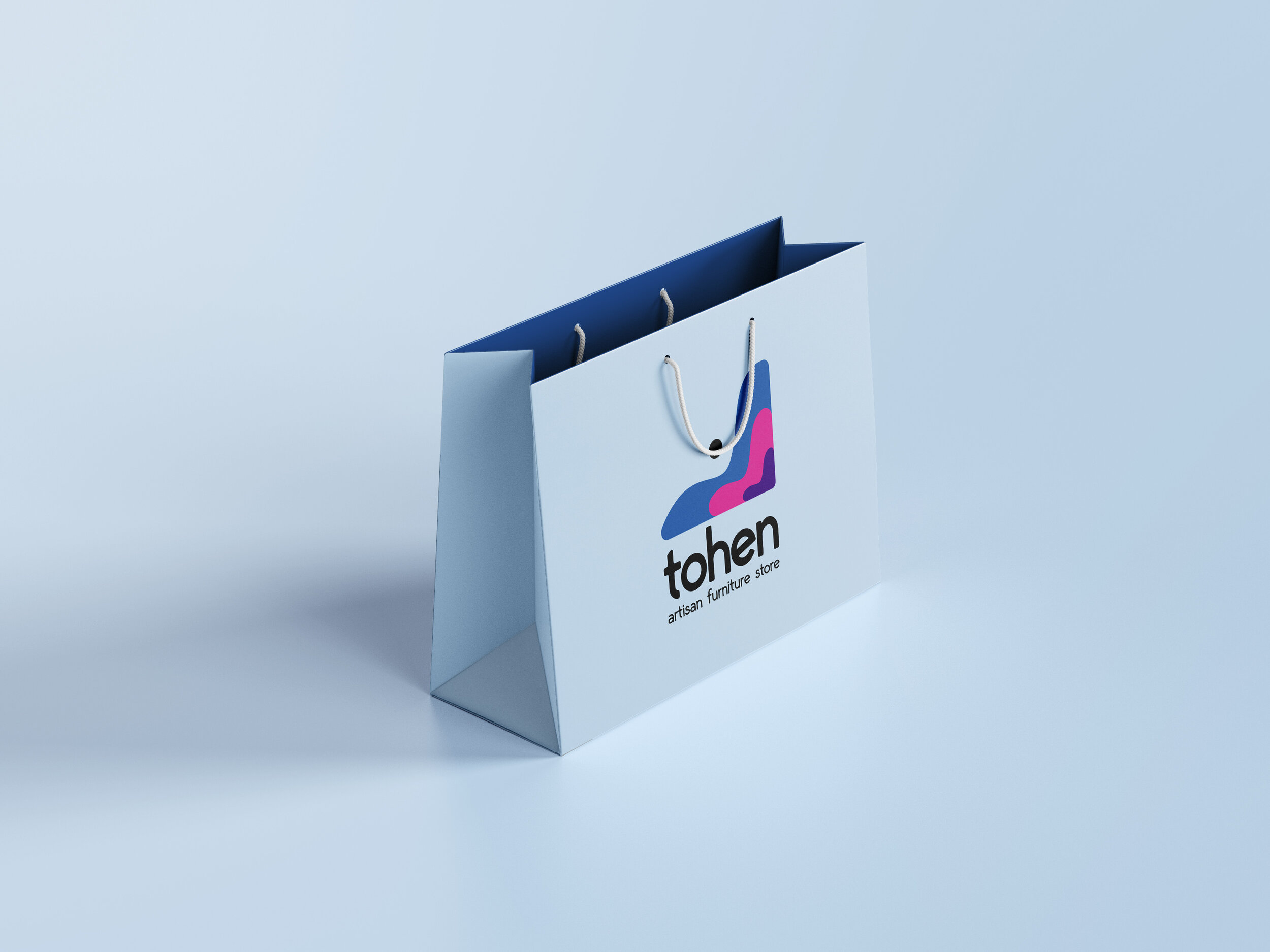
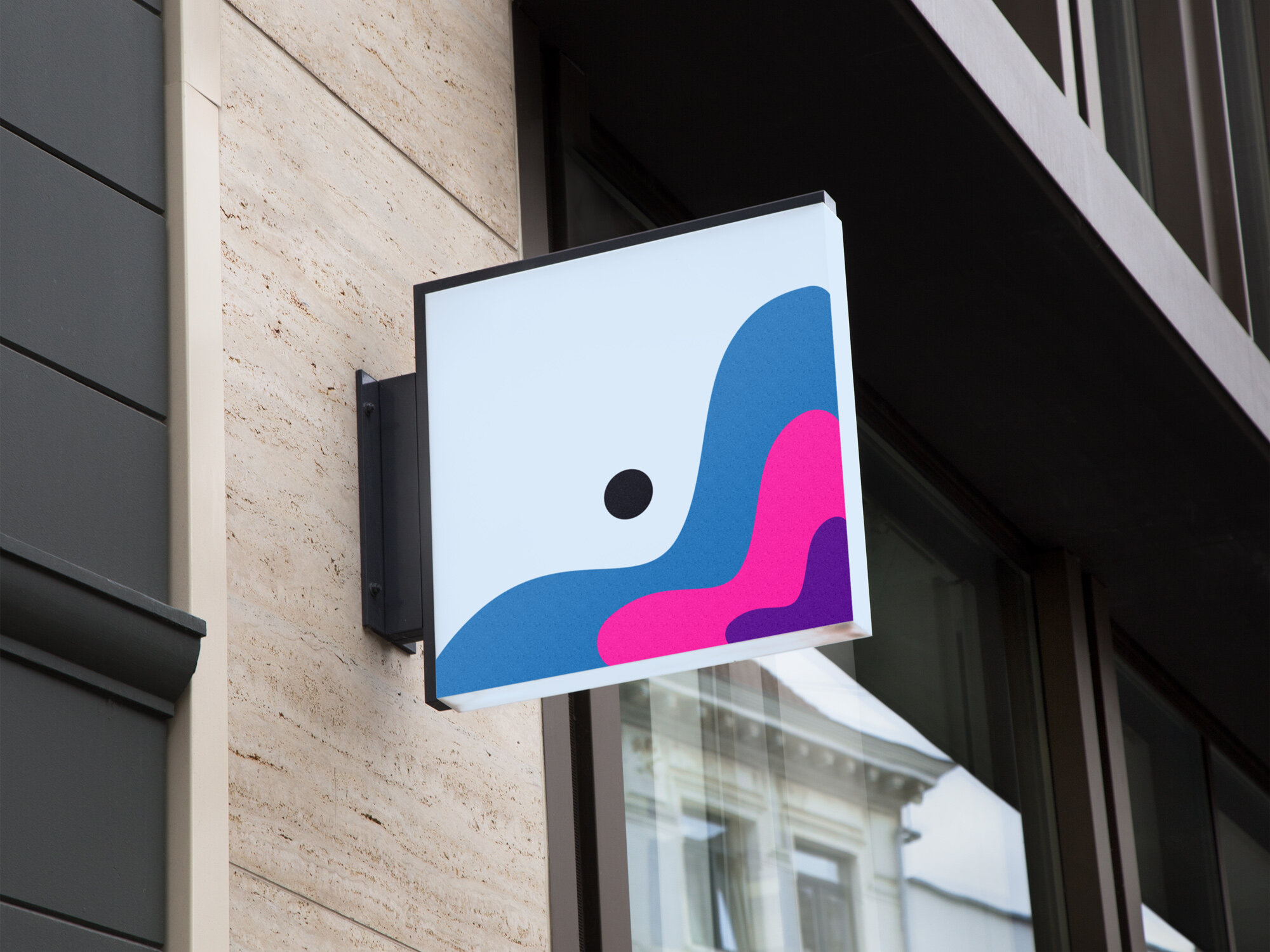
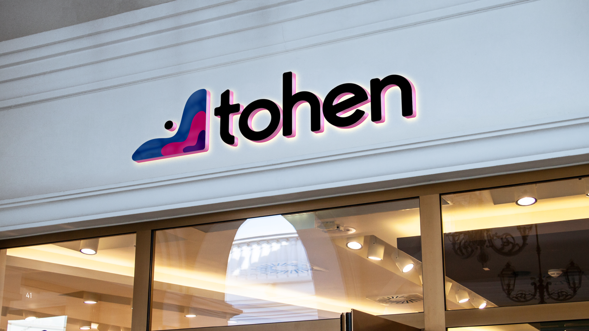
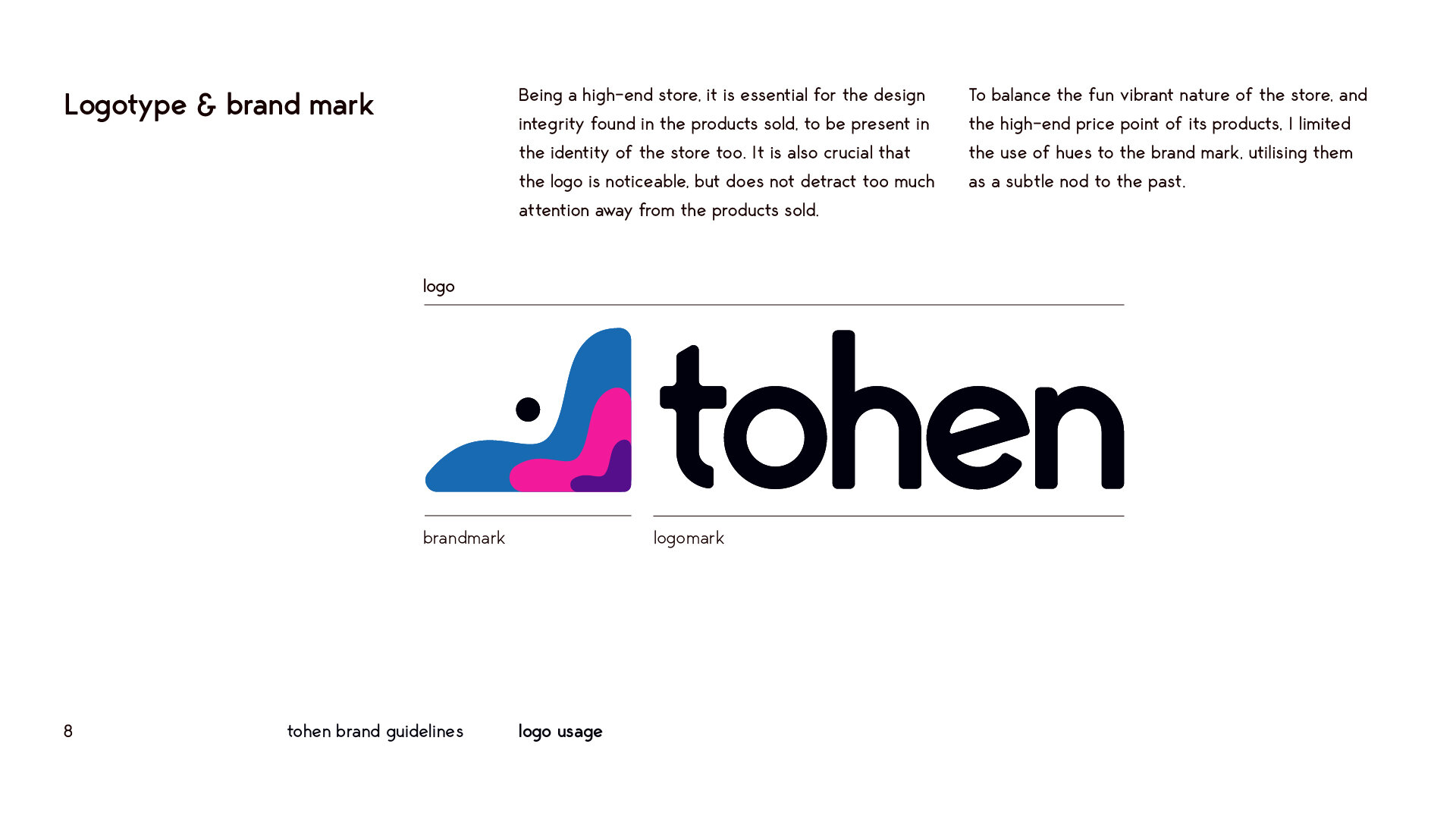
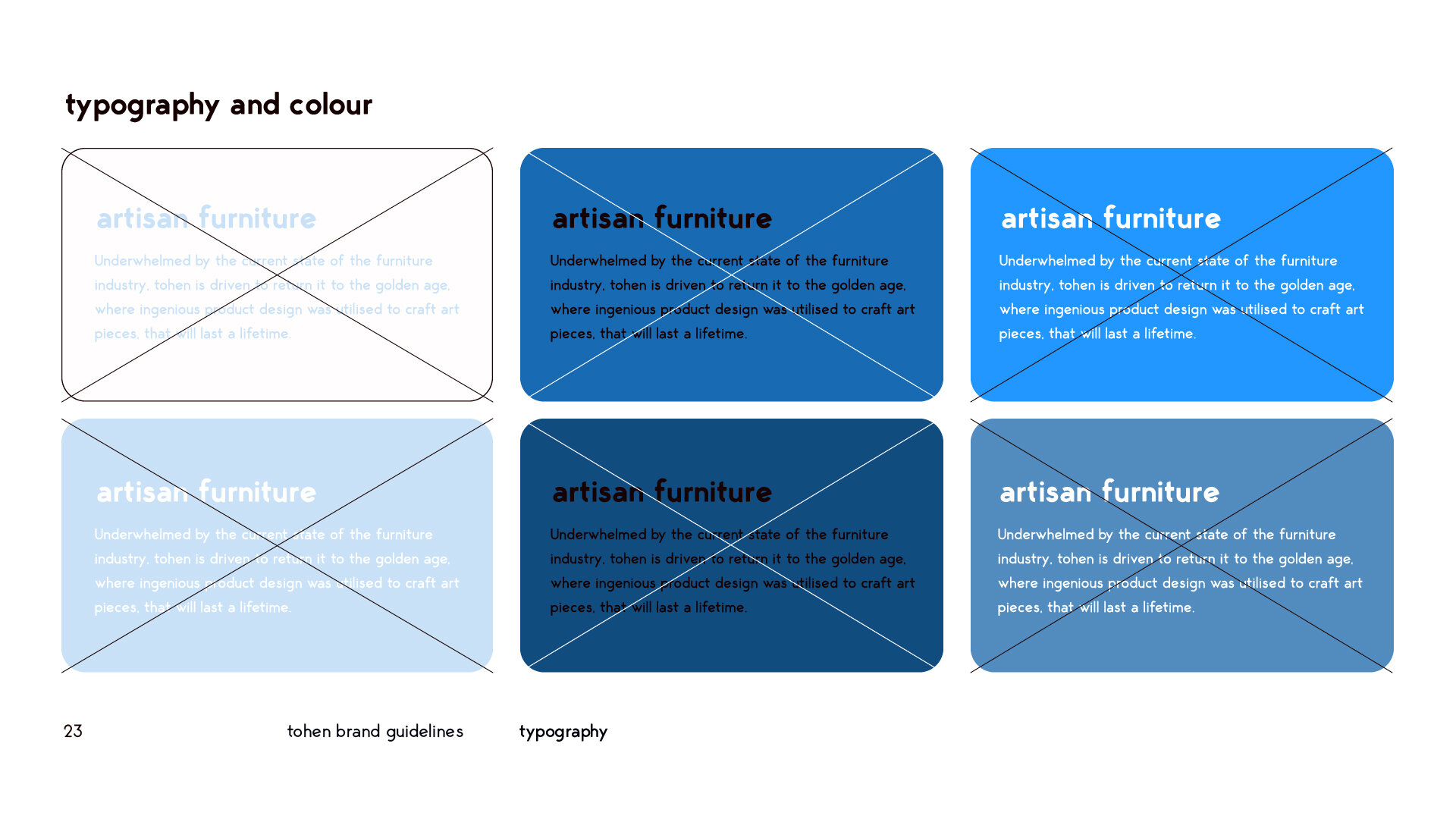
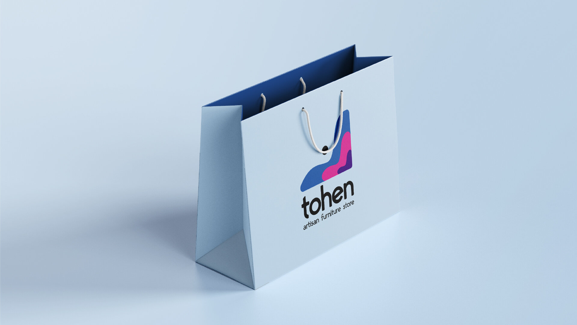
Being a high-end store, it was essential for the design integrity found in the products sold, to be present in the identity of the store too. It is also crucial that the logo is noticeable, but does not detract too much attention away from the products sold. To balance the fun vibrant nature of the store, and the high-end price point of its products, I limited the use of hues to the brand mark, utilising them as a subtle nod to the past.
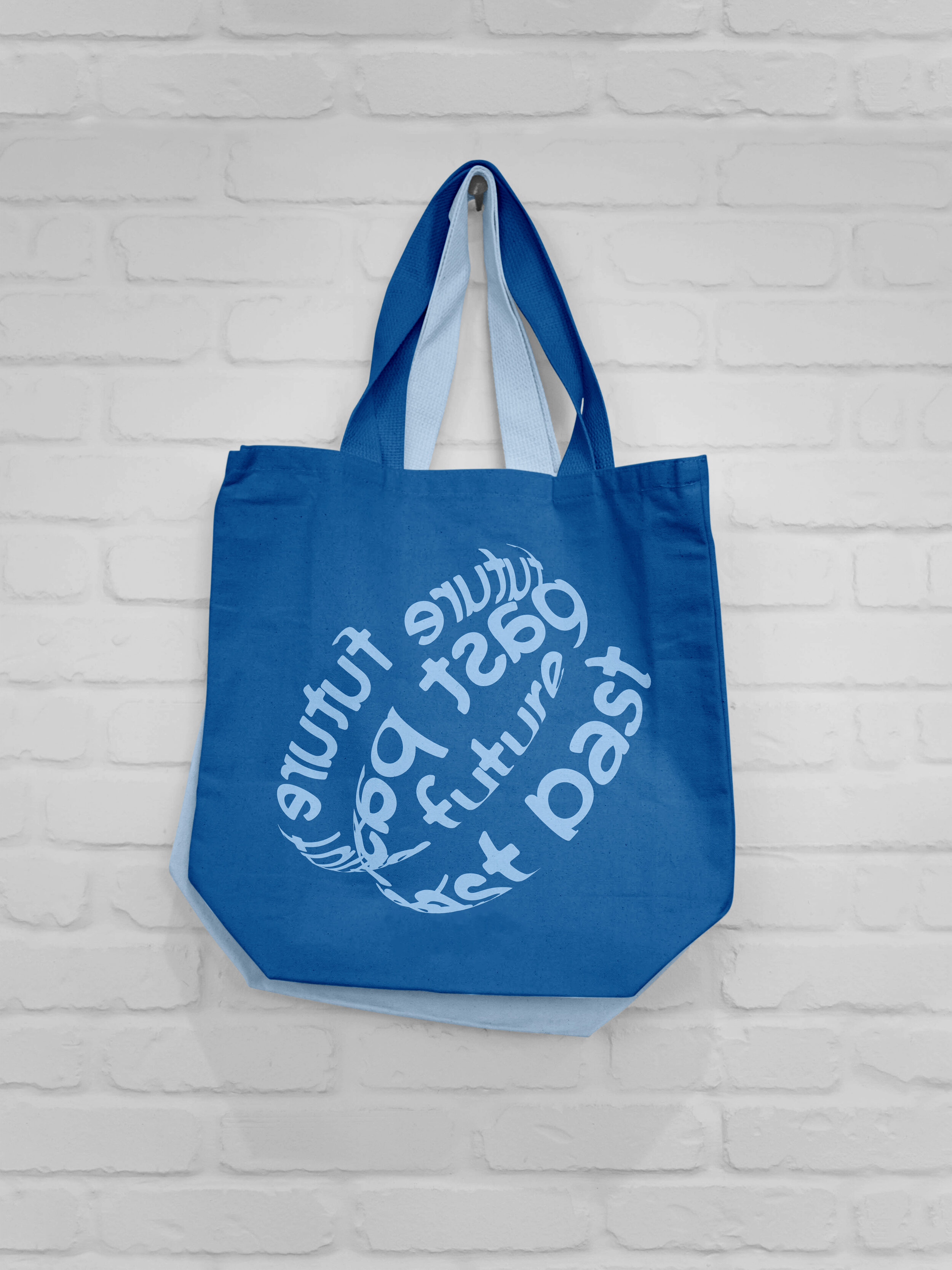
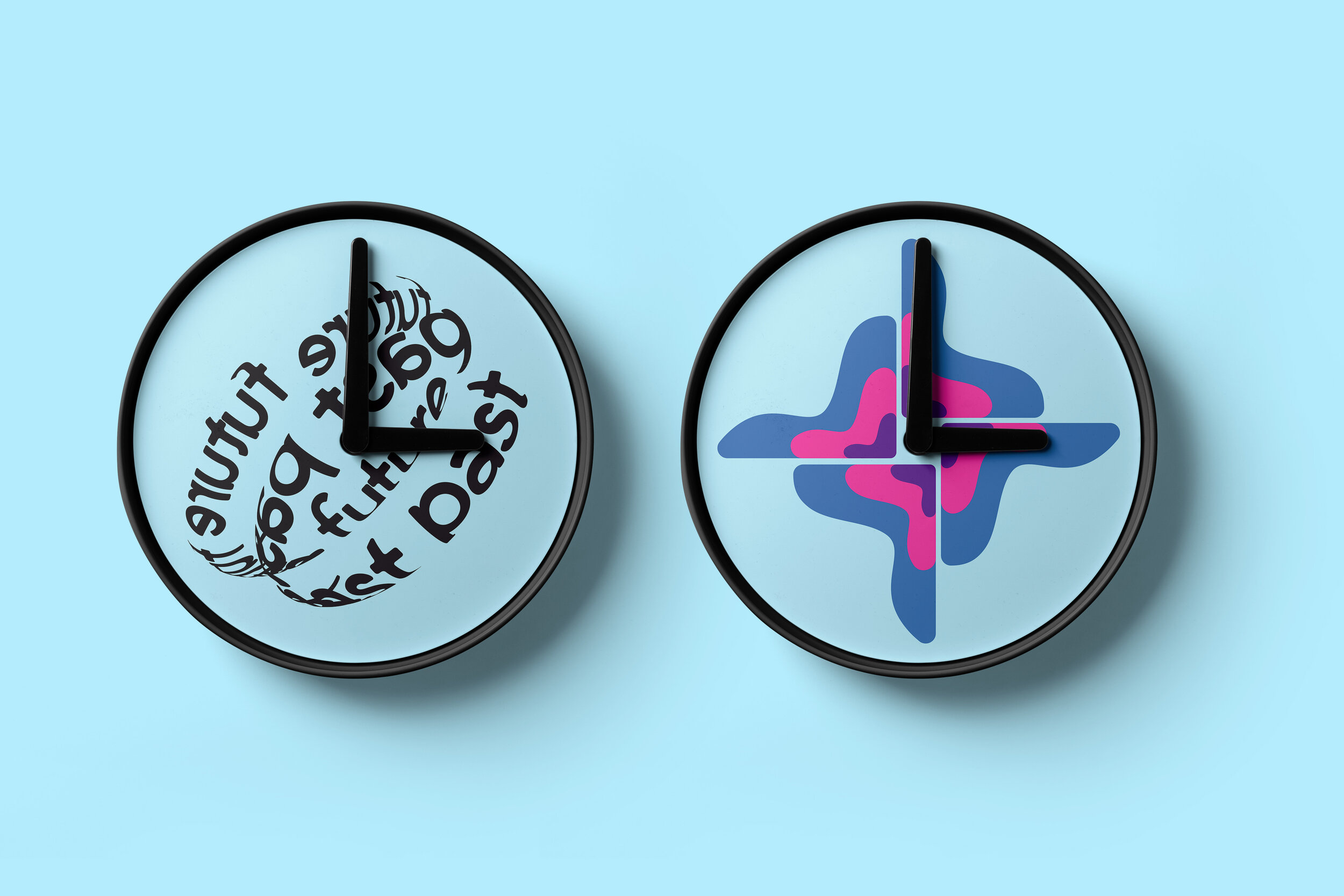
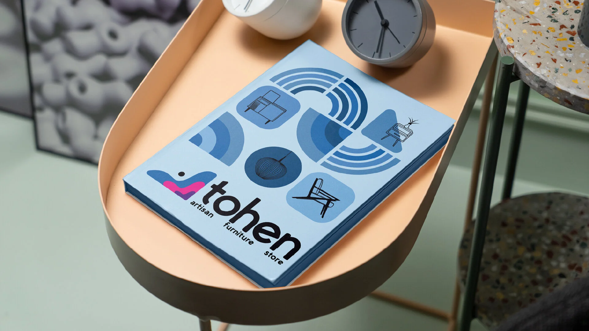
Referencing the shapes found throughout mid-century modern furniture, a rounded typeface from the 1960s, George Rounded, was selected. Inspired by a custom typeface found on an old book cover from the era, George rounded captures the same energy and playfulness.
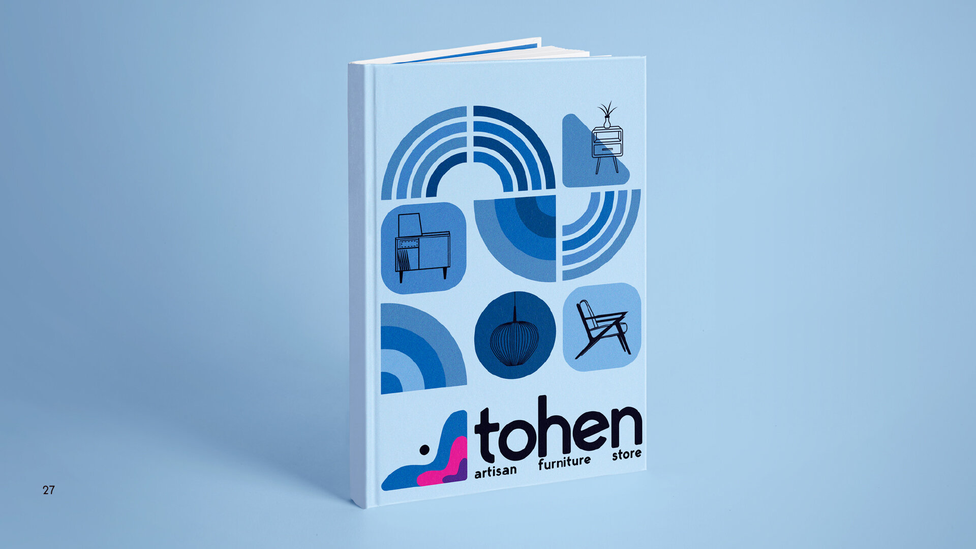
The tohen graphic system is made up of rounded shapes and patterns, inspired by artwork from the 1960s. The curved forms ensure they fit harmoniously with the rest of the brand’s identity. Secondary blue hues are used for these elements.

Brand Guidelines
To support the creation of tohen, I crafted an entire visual language around the brand, with strict guidelines as to how the brand should be shown, ensuring the identity remains consistent. Please browse exerts from the guidelines below.
Brandmark
tohen place immense importance on the detailing and comfort of their products, so it was important to visualise this in the brandmark, which is an abstract interpretation of the curves found throughout chairs of the period. A small dot is added, to add some asymmetry to the mark, whilst also subtly nodding to the care-free attitude of the time, symbolised by the popular ying-yang symbol.
Wordmark
The same essence is echoed throughout the wordmark, by selecting a bold rounded typeface, George Rounded, circa the time period. The kerning between the letters was delicately edited to ensure the wordmark looked balanced. The font is playful, with the rotated ‘e’ particularly engaging. To sharply contrast with competitive high-end stores, the wordmark is all placed in lowercase, to extenuate tohen as an outlier in the industry.


tohen’s personality is free, rebellious and bold. Echoing the culture it celebrates, tohen is unapologetic in its vibrant and bold approach. It aims to recapture the same free revolutionary spirit found in the 1960s, within all of its products.