Graphic Design, Branding & Art Direction
The Marmite of all Re-brands.
I sit very much in the love Marmite camp. Brand positioning; love. Taste; love. Their slogan ‘Love it or Hate it’ is genius, a wonderfully fun take on the distinct flavour of the product. However, I have always been let down by the visual language Marmite create around this.
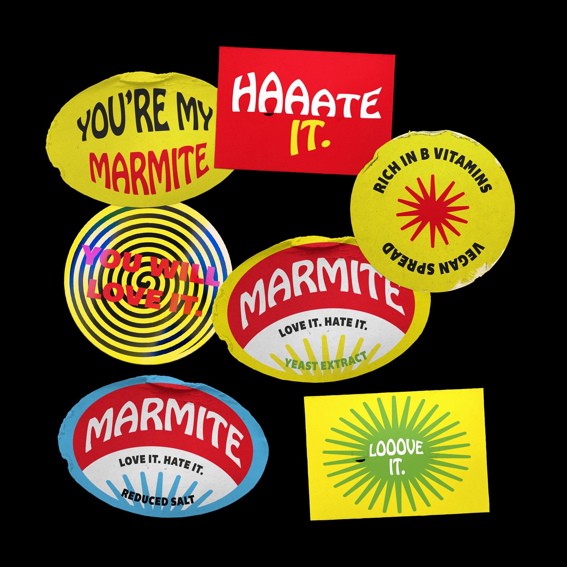
At its core, the message Marmite communicate around is bold, playfully divisive and slightly wacky. It is this light-hearted abrasiveness that is missing from their branding, that I have injected through this brand evolution.


Playfully Divisive
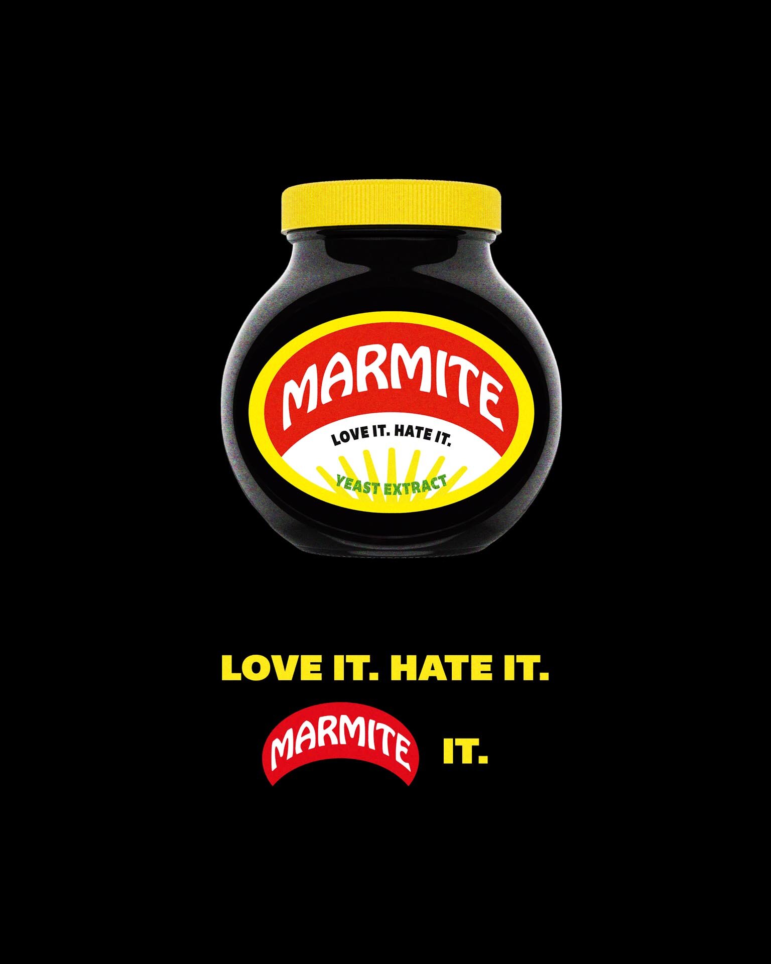
The logo and product label of Marmite is almost inseparable, so I subtly simplified both to ensure they remained harmonious. However, to better align with its identity I updated the typography throughout. The logotype now sits in Hobo Std Medium, bursting with personality. Strength is maintained with the use of Bemio for headers, and what better font to use for the body copy but the Marmite of all fonts; Helvetica Neue.
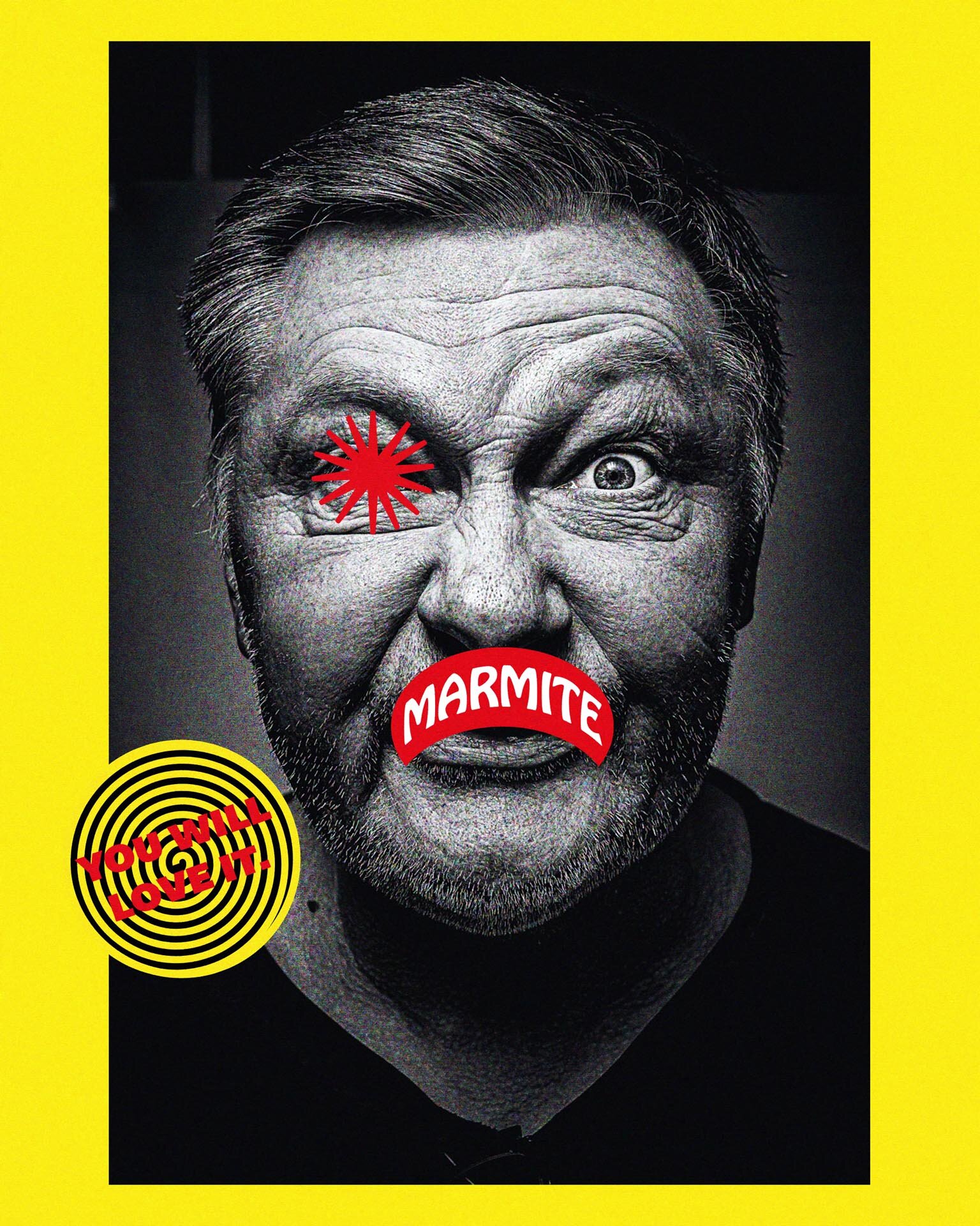
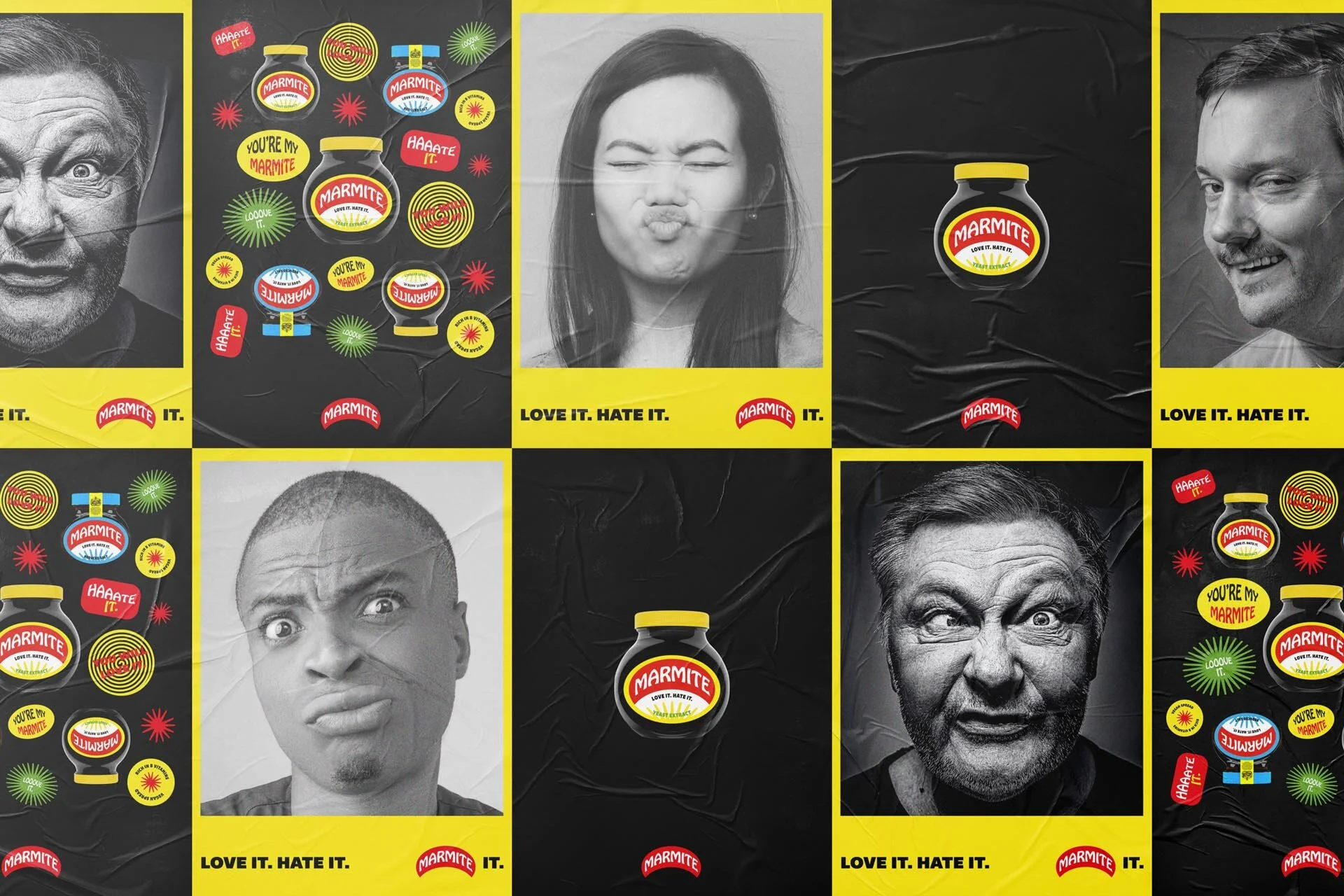
To better visualise the abrasive essence of Marmite, I incorporated a tactile quality into the brand. This was achieved via the addition of noise on visuals and nods to the DIY/punk aesthetic in physical products.


With the supporting photography, I captured the true nature of the product, that sharp and distinct flavour you get when you first taste it. High contrast, close up portrait imagery captures that moment, and the consumer’s reaction, whether it be love or hate. The bright hues of Marmite are bold enough to carry the brand, so all photography is set in black and white to not further diversify the palette.