

Branding, Digital Design & Animation
Fueling Adventures
With the mobile nature key to the service Surrey Hills Coffee Co offer, touring the beauty walking spots throughout the county, it was key to visualise this in the identity. What links all of the locations they tour, are the type clients found there. Visiting these spots, they search for adventure, escape, and discovery, especially in this post lockdown world. It is this essence I tapped into when crafting their visual identity.
As the local industry is over-saturated with brands that make use of illustrations, it will differentiate the brand to instead use a graphic system that celebrates the areas they visit. As these spots are walking spots, I aligned the brand with the clients' exercise they partake in while consuming the product. As the coffee being sold is high quality and expensive, the brand reflected this with its refined approach.


Branding
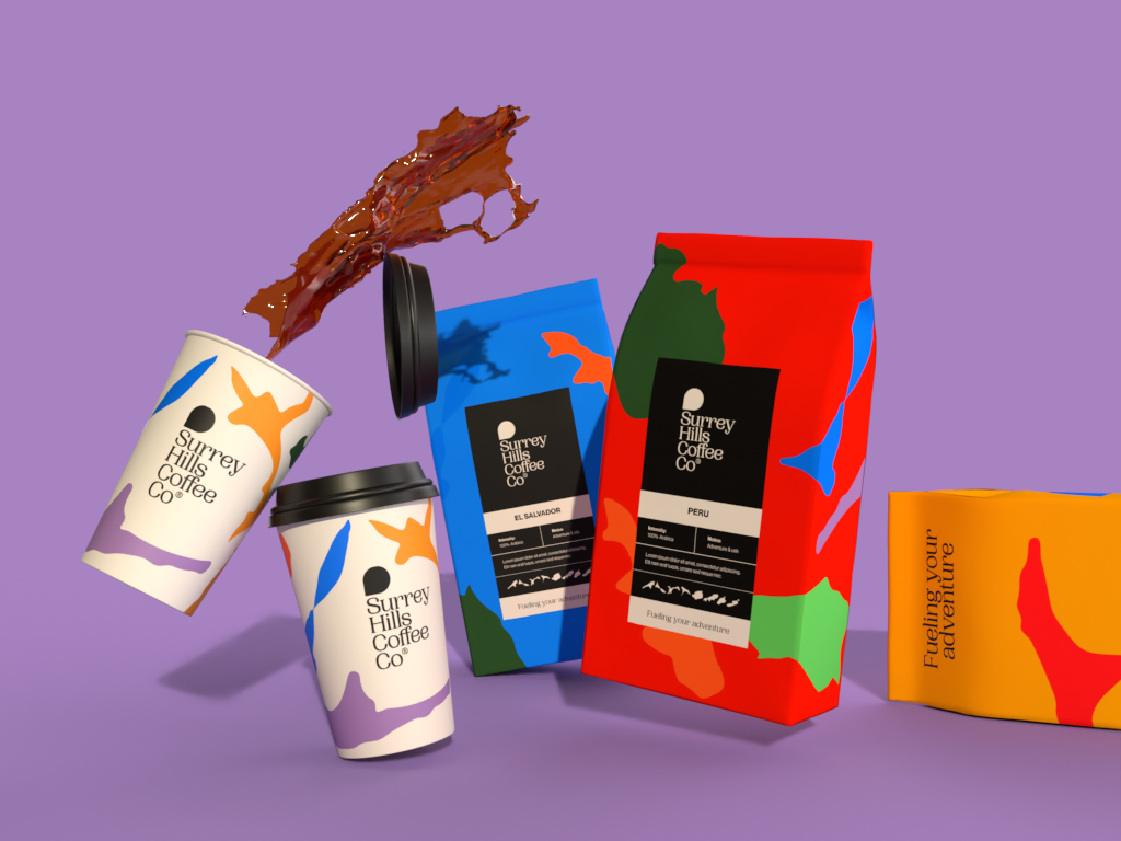
My branding solution captures the essence of the area and explores the link to the activity of walking/cycling in the hills. It also provides the refined elegance required to appeal to the target audience.
Wordmark
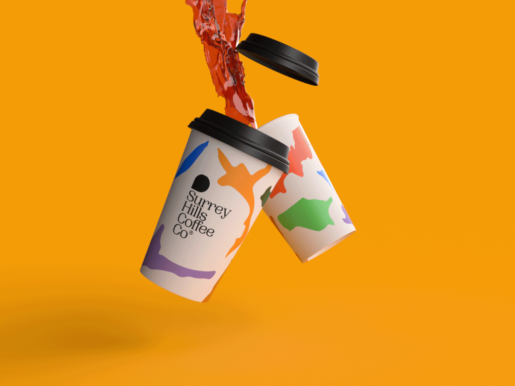
The wordmark is set in the aptly named Woodland font. The curvy serif typeface is fluid in its shape, reminiscent of the beautiful Surrey Hills. The wordmark is stacked to ensure each word receives the same amount of importance. ‘Surrey’ the location, ‘Hills’ the adventure, ‘Coffee’ the fuel and ‘Co’ working together are all key to the brand’s identity.
Brandmark
The brandmark is a rotated dropped pin, visualising the dynamic nature of the company’s business, moving from location to location. It is also symbolic of the sensation we want users to feel when in these environments with our product; harsh lines to smooth. Taking the edge off.


Palette & graphics
A diverse and bold colour palette was developed to extend the themes of adventure and fun. The colours also visualise some of the hues found in the Surrey Hills throughout the seasons. It was essential to create an extensive palette so that each accent colour could be applied to each of the van’s locations and walks. They showcase the walk’s difficulty, like ski slopes.
To celebrate the area’s in the Surrey Hills that the van tours, a graphic was created for each. To encourage clients to explore the area, each is an outline of a created walk around the area, which the van will provide more detail on.

