Branding, Digital Design & Animation
Batteries for the Future
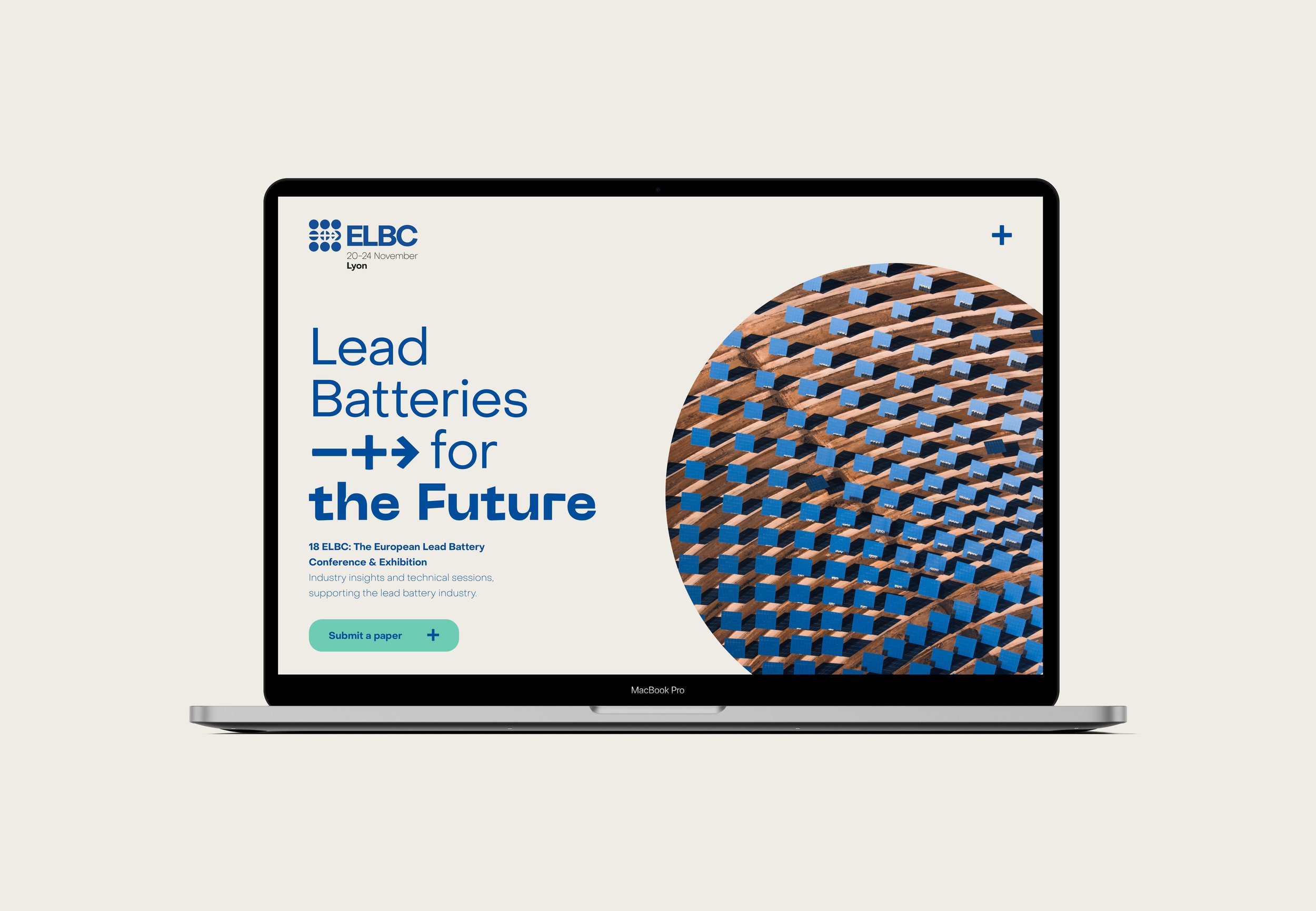
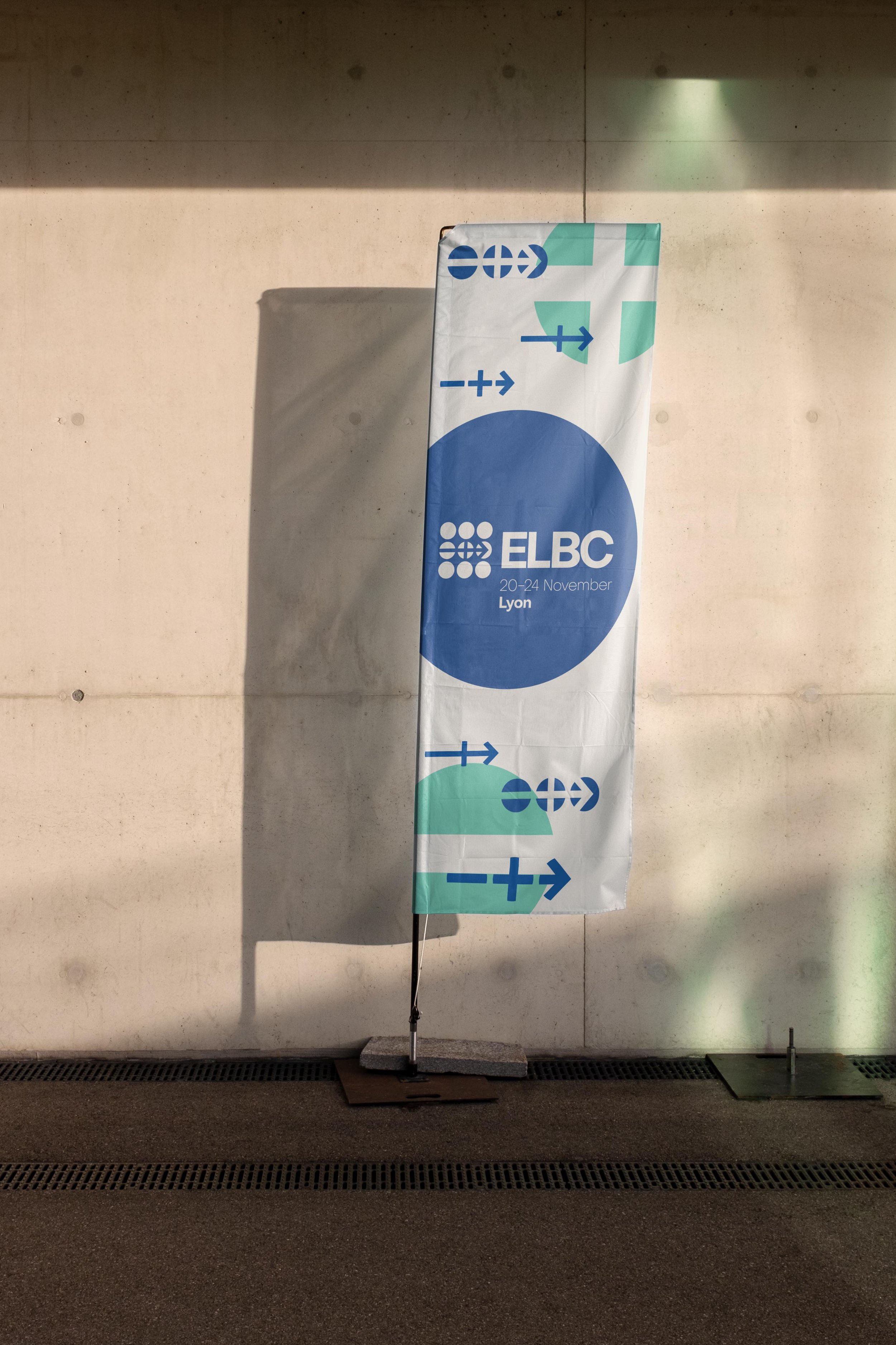
Forward focused brand identity crafted for the European Lead Battery Conference (ELBC). To be held in Lyon in late 2022, it is set to be the biggest lead battery innovation event yet, with a packed program including market insights, energy storage systems, automotive battery updates and the latest in research and technological innovations. With the subject matter of the conference focusing on innovation and an intelligent future, it was essential to reflect these attributes in the identity.
The perfect balance was found by crafting a futuristic direction that still remained credible and accessible, ensuring the conference appealed to the target audience.

Logo Explanation
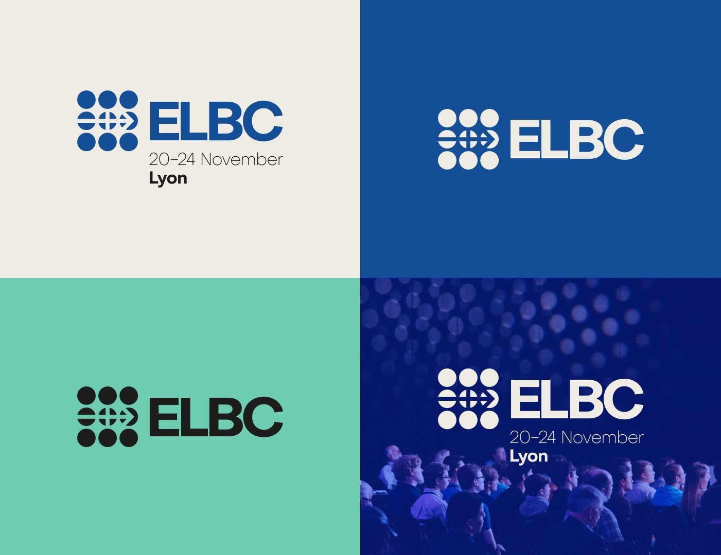
Geometric shapes form the brand mark, which symbolises the three main components of the conference: a network of people who come together, the subject matter (batteries) and its forward-focused direction.
The use of negative space outlines an arrow pointing up and to the right I.e. ‘forwards’. The brain connects the dots and finishes the shape in the mind’s eye, making the logo more memorable.
Wordmark
The modern Object Sans used in the wordmark presents the conference as forward-focused, but still boasts a subtle personality.
The organic curved nature of the shapes formed by the typeface aligns perfectly with the ILA and CBI branding (The two companies that put on the ELBC) to ensure cohesion through all communications.
Brandmark
The brand mark is a combination of graphic elements that visual the ethos of the brand.
The nine circles represent the network of individuals that the event brings together, with negative space used to outline an arrow pointing to the right i.e. ‘forwards’ symbolising the direction of the company. This also creates shapes that reference the positive and negative battery icons.


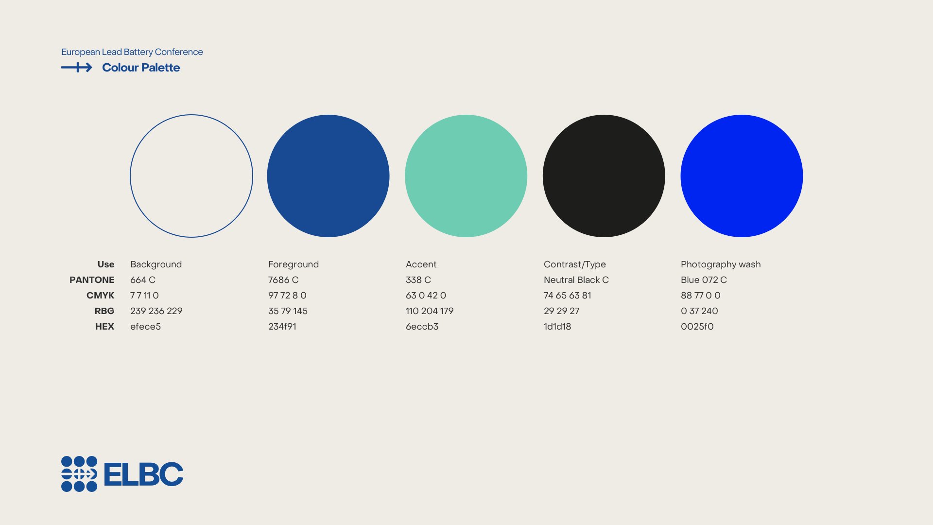
Palette & Typography
Neutral and trustworthy off-white and navy blue are used as the main colours to create a credible base, with a teal green used as an accent colour to reference the ‘green’ nature of the products on show. Black is also used when contrast is required, and a lighter blue is used when treating photography.
The identity makes use of the two font families. Neue Machina for headers, and Object Sans for in the logo and throughout body text, buttons and sub headers. Neue Machina is a powerful and meticulously crafted typeface boasting monospace/geometric type features. It is inspired by the aesthetics of robotics and machines; a font suited for the future of technology.